
 |
|
||||||||||||
|
|
||||||||||
|
||||||||||
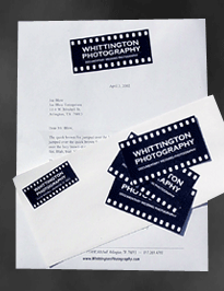
| Simple. Clean. Functional.
Designs that stand the test of time usually consist of all three of these elements. Whether you’re talking about classic architecture or great golf courses, the best designs are usually brilliantly simplistic. Whether it’s a web site or a corporate identity package for your business, my goal is the same – create something that is simple, clean and functional. A design that invites your audience to come back again and again. I believe the best designs rarely produce that immediate “wow” factor. In fact, at first glance you might even feel slightly underwhelmed. However, the more you look, the more you find the design grows on you. That is the mark of a design that stands the test of time. Having said that, if I were to sum up the design philosophy of Durham Graphics in a few words it would be “controlled creativity.” Simply put, I believe the design should never overpower the content. The role of a graphic designer is simple: package information in a way that most effectively conveys the intended message. This “less is more” philosophy isn’t new by any means, but still it is not a principle that many designers put into practice. Why? I believe there are a couple of reasons. With today’s advanced graphic design programs, there is always the temptation to include an element in your design simply because you can. Thousands of design elements are available at the touch of a button. You no doubt have seen designs which seem to be nothing more than a dizzying mixture of colors, charts, photos and graphics. There does not appear to be any flow to the design and, in fact, there isn’t. The Web has its own share of design disasters. Who hasn’t landed on a Web site saturated with Flash animation, JavaScript and every other bell and whistle imaginable? Flashy yes, but almost impossible to navigate. Worse yet, even more difficult to find the desired information. In both these cases, the designer has probably fallen victim to the temptation of using every design element at his disposal. For others it’s simply an ego thing. Many graphic designers see each project as an opportunity to show everyone just how talented they really are. So they load the project with as many colors and elements as they can possibly cram in, whether they are necessary or not. But by drawing all the attention to their great design abilities, they have all but buried the content and done the client a great disservice. Talk to an experienced referee and he will tell you he has done a good job when nobody in the arena notices him. His job is to facilitate the playing of the game, not to become the focal point of it. Similarly, I believe the best graphic design is one which clearly conveys the intended message without getting in the way of it. If your “visual masterpiece” draws attention away from the content, then you have failed your client. The best graphic design carefully maintains the delicate balance between visual appeal and content. Conveying information in a visually appealing way is the cornerstone of good graphic design. Though two very different worlds, I believe they can – and should – live harmoniously. |
||||||||||
|
|
||||||||||
Copyright ©2002-2016 Ron Durham Enterprises. |
||||||||||